Play Text-to-Speech:
The 7QC tools, also known as the Seven Quality Control Tools, are a set of problem-solving techniques that were first introduced by Dr. Kaoru Ishikawa in the 1960s. These tools have been widely used in quality control and process improvement across a range of industries, from manufacturing and healthcare to finance and education. In this article, we will delve into each of the 7QC tools, explaining their purpose, benefits, and how to use them effectively.
1. Pareto Chart:
The Pareto Chart is a simple yet powerful tool that helps to identify the most frequent or significant sources of a problem. It is based on the Pareto principle, which states that 80% of the effects come from 20% of the causes. To create a Pareto Chart, you need to first collect data on the problem you are trying to solve. This could be anything from customer complaints to defects in a manufacturing process. You then categorize the data into groups and plot them on a bar chart, with the tallest bars on the left-hand side and the shortest on the right-hand side. This allows you to quickly see which categories are contributing the most to the problem.
The benefits of using a Pareto Chart are numerous. Firstly, it helps to focus your attention on the most important issues, so that you can prioritize your efforts accordingly. Secondly, it provides a visual representation of the problem, which can be easier to understand and communicate than a written report. Finally, it helps to identify areas where improvements can be made, which can lead to significant cost savings and improvements in efficiency.
Software tools that can be used to develop Pareto chart: Microsoft Excel, Minitab, QI Macros, and SigmaXL.

2. Cause-and-Effect Diagram:
The Cause-and-Effect Diagram, also known as the Fishbone or Ishikawa diagram, is a tool used to identify the root cause(s) of a problem. It is called a Fishbone diagram because it looks like the skeleton of a fish, with the problem at the head of the fish and the causes branching out like the bones of the fish. To create a Cause-and-Effect Diagram, you start by writing the problem you are trying to solve at the head of the fish. You then brainstorm all the possible causes of the problem and write them on the bones of the fish. You can then analyze the diagram to see which causes are the most likely to be contributing to the problem.
The benefits of using a Cause-and-Effect Diagram are that it encourages a systematic approach to problem-solving, helps to identify multiple causes of a problem, and can be used to generate ideas for solutions. It also helps to focus attention on the underlying causes of the problem, rather than just the symptoms.
Software tools that can be used to develop Cause-and-effect diagram: Microsoft Excel, Minitab, QI Macros, and SmartDraw. There are also online tools available such as Creately, Canva, and Lucidchart that can be used to create cause-and-effect diagrams.

3. Control Chart:
The Control Chart is a tool used to monitor and track process performance over time, and to identify any trends or shifts that may indicate a problem. It is based on the statistical principle of variation, which states that all processes have some degree of natural variation. To create a Control Chart, you first collect data on the process you are trying to monitor. This could be anything from the time it takes to complete a task to the number of defects produced. You then plot the data on a chart, with the mean (average) value in the center and the upper and lower control limits above and below the mean. Any data points that fall outside the control limits are considered to be outliers and may indicate a problem.
The benefits of using a Control Chart are that it provides a visual representation of process performance, helps to identify any trends or shifts in the data, and can be used to predict future performance. It also helps to distinguish between natural variation and special causes of variation, which can be useful in identifying areas for improvement.
Software tools that can be used to develop Control chart: Microsoft Excel, Minitab, QI Macros, and SigmaXL.

4. Scatter Plot:
The Scatter Plot is a tool used to identify any patterns or relationships between two variables, such as the relationship between temperature and humidity or the relationship between sales and marketing spend. To create a Scatter Plot, you first collect data on the two variables you want to analyze. You then plot the data on a chart, with one variable on the x-axis and the other on the y-axis. If there is a relationship between the variables, you will see a pattern emerge on the chart, such as a straight line or a curve. This can help you to understand how the variables are related and whether there is a causal relationship between them.
The benefits of using a Scatter Plot are that it helps to identify any patterns or relationships between variables, which can be useful in predicting future performance or identifying areas for improvement. It also provides a visual representation of the data, which can be easier to understand and communicate than a written report.
Software tools that can be used to develop Scatter diagram: Microsoft Excel, Minitab, QI Macros, and SigmaXL.

5. Histogram:
The Histogram is a tool used to visualize the distribution of a set of data, and to identify any outliers or unusual patterns. To create a Histogram, you first collect data on the variable you want to analyze. You then group the data into intervals or “bins” and plot the number of data points that fall into each bin on a bar chart. The height of each bar represents the frequency or number of data points that fall into each bin. This allows you to see the shape of the distribution and whether there are any outliers or unusual patterns in the data.
The benefits of using a Histogram are that it provides a visual representation of the data, which can be easier to understand and communicate than a written report. It also helps to identify any outliers or unusual patterns in the data, which can be useful in identifying areas for improvement or investigating potential causes of a problem.
Software tools that can be used to develop Histogram: Microsoft Excel, Minitab, QI Macros, and SigmaXL.

6. Check Sheet:
The Check Sheet is a tool used to collect and organize data in a structured way, and to identify any trends or patterns that may emerge. To create a Check Sheet, you first define the problem you want to investigate and the data you want to collect. You then create a table or form to record the data, with columns for each category of data and rows for each occurrence of the problem. As data is collected, it is recorded on the Check Sheet, which allows you to quickly see which categories are the most common and whether there are any trends or patterns in the data.
The benefits of using a Check Sheet are that it provides a structured and systematic approach to data collection, which can help to ensure that all relevant data is collected and recorded accurately. It also helps to identify any trends or patterns in the data, which can be useful in identifying areas for improvement or investigating potential causes of a problem.
Software tools that can be used to develop Check Sheet: Microsoft Excel, Google Sheets, Tallyfy, and QI Macros.
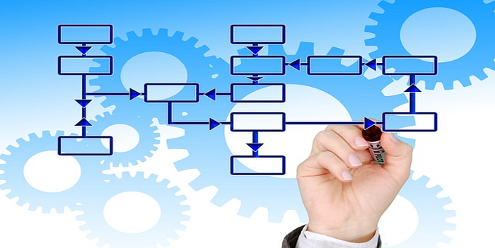
7. Flowchart:
The Flowchart is a tool used to map out a process or system, and to identify any bottlenecks or areas where improvements can be made. To create a Flowchart, you first define the process or system you want to analyze and the steps involved. You then map out the process on a diagram, using symbols to represent each step and arrows to show the flow of the process. This allows you to see the entire process at a glance and to identify any areas where improvements can be made.
The benefits of using a Flowchart are that it provides a visual representation of the process, which can be easier to understand and communicate than a written report. It also helps to identify any bottlenecks or areas where improvements can be made, which can lead to significant cost savings and improvements in efficiency.
Software tools that can be used to develop Flowchart: Microsoft Visio, Lucidchart, SmartDraw, and Creately.
Conclusion:
In conclusion, the 7QC tools are a set of problem-solving techniques that have been widely used in quality control and process improvement across a range of industries. Each tool has its own purpose and benefits, from identifying the most significant sources of a problem (Pareto Chart) to mapping out a process or system (Flowchart). By using these tools effectively, organizations can gain insights into their operations, identify areas for improvement, and make data-driven decisions.
The 7QC tools are not only useful in the manufacturing industry but can also be applied to service industries, healthcare, education, and government. They provide a structured and systematic approach to problem-solving that can help organizations achieve their quality and performance goals.
When using the 7QC tools, it is important to remember that they are not a one-size-fits-all solution. They should be used in conjunction with other problem-solving methods and tailored to the specific needs of the organization and the problem being addressed.
Additionally, the success of the 7QC tools depends on the quality of the data collected and analyzed. It is essential to collect accurate and relevant data and to ensure that it is analyzed and interpreted correctly.
Overall, the 7QC tools provide a powerful set of techniques for problem-solving and process improvement. By mastering these tools, organizations can improve their quality, reduce costs, and enhance their overall performance.

Maintenance, projects, and engineering professionals with more than 15 years experience working on power plants, oil and gas drilling, renewable energy, manufacturing, and chemical process plants industries.